
For the first time in 10 years, Starbucks is debuting new whole bean coffee packaging designs inspired by the people, moments and experiences associated with each blend. Created by Starbucks talented design team and still the same delicious coffee our customers enjoy, each packaging redesign tells a unique story about the coffee roast’s origin and tasting notes.
Designing a new core coffee bag can be a daunting task. Unlike seasonal coffees such as Starbucks® Christmas Blend (or even holiday cups!) core coffee packaging does not change every year. In fact, the design is intended to last at least 10 years. So, how does the bag tell the story of the beans inside?
It always begins with the coffee.
Sergio Alvarez, coffee/tea development lead on Starbucks Coffee team, partnered with the Starbucks Creative Studio to share the stories behind the beans – starting with tasting notes and descriptive words to highlight the flavors of each unique coffee blend.
“We have a very unique and thoughtful way that we develop coffee blends at Starbucks and we wanted to make sure that came through in how we describe them,” Alvarez said. “Depending on the blend, depending on the roast and depending on the region, there are different flavors that we associate with each of these special coffees.”
Although the coffee flavor profiles are the same delicious coffees customers know and love, the new packaging uses more descriptive and culinary terms to describe the flavor notes – like Veranda Blend®, which was updated from “mellow and soft” to “toasted malt and milk chocolate” and Italian Roast, which went from “roasty and sweet” to “dark cocoa and toasted marshmallow.”
Storytelling through art
“Our coffee reminds us of people, or moments, or experiences, and we were able to explore that in the way we approach our coffee packaging,” Alvarez said.
Translating those stories into art was a fun challenge for the Creative Studio’s designers and illustrators, as they sought to weave together past, present and future while tapping into Starbucks new creative brand expression.
“Our legacy has used hand-done illustration to bring warmth and brand connection. We wanted to continue to tie a thread to our new packaging,” said Derek Shimizu, associate creative director for the Creative Studio. “We also wanted to make sure we were staying modern while looking forward into our brand.”
The strategic selection of colors is one of the most important elements of the design. With every creative brand expression since the packaging refresh of 2011, and again with the most current update from 2013, designers have used palettes of gold, copper and purple to signify roast intensity. The new designs continue using those visual cues to identify Blonde (gold), Medium (copper) and Dark (purple) roasts.
Now, what to draw? Illustrators would often start with iconography and motifs that recall past designs. An Italian scooter found its way again on to the front of Italian Roast, as did the roses that adorn Caffè Verona®. And it wouldn’t be Komodo Dragon Blend® without its eponymous lizard. They also worked to incorporate coffee cherries and botanicals into the designs to highlight the origins of coffee.
Deconstructing the new bags


Designers also consider what they call the “architecture” of each bag to make it easy to shop for their coffees, whether they are in Starbucks stores or the grocery aisle. They created a badge system that is consistent across the roast spectrum with design details that clearly identify roast and tasting notes. They highlighted Starbucks commitment to responsibly grown coffee by bringing the ethical sourcing stamp to the front, underscoring the company’s commitment to positively impacting the lives and livelihoods of coffee farmers and their communities. There’s also a traceability code on the back of the bags sold in Starbucks stores that can connect customers in the U.S. and Canada to where the coffee is grown using the Starbucks Digital Traceability tool.
“Our current packaging was artful and expressive, but every bag had a different typography, different icon placement, which made it a little bit hard to navigate or find where you were within the roast,” said Shimizu. “We wanted make all of those elements straightforward and easy for the customer to navigate with this refresh.”
Read on for details about some of Starbucks new coffee bag designs.
Starbucks® True North®

In 2013, Starbucks Canada named a coffee for Canadians, by Canadians. True North Blend® was born after 22,000 entries were submitted in a nationwide contest to name this unique blonde roast that is available today at Starbucks locations across the country. An approachable, easy-drinking coffee, this blend was inspired by the lightly roasted coffees we’ve enjoyed together over the years – subtle but flavourful with notes of toasted nuts and milk chocolate.
“For this design, I wanted to create artwork that highlighted the natural beauty of Canada, as this coffee is made especially for this market,” said Taylor Mattson, Starbucks designer and illustrator. “Clouds of coffee steam interweave through a forest terrain of hillsides and trees, adding some visual levity that highlights the light roast of this coffee. Predominately using yellows, tans and oranges the artwork brings in light and warm hues that also speak to the flavour profile of toasted nuts and soft cocoa.”
Starbucks® Siren’s Blend ®

Named for the Siren that symbolizes Starbucks, this was inspired – and created – by trailblazing women of the coffee industry. Combining coffees from East Africa and Latin America, two regions where Starbucks works everyday to elevate women’s leadership and responsible farming practices, every aspect of this coffee’s journey is touched by women — from sourcing, roasting and blending to the design on the bag.
“We challenged ourselves to create Sirens that felt gestural and abstracted – but also clearly depicted. The solution was art without any faces on the front of the bag, only showing Siren tails layered over artful coffee botanicals,” said Abby McCartin, Starbucks designer and illustrator. “It results in a beautiful feeling of mystery inspired by Siren folklore while also telling a story of sisterhood in the coffee industry in a subtle and sophisticated way.
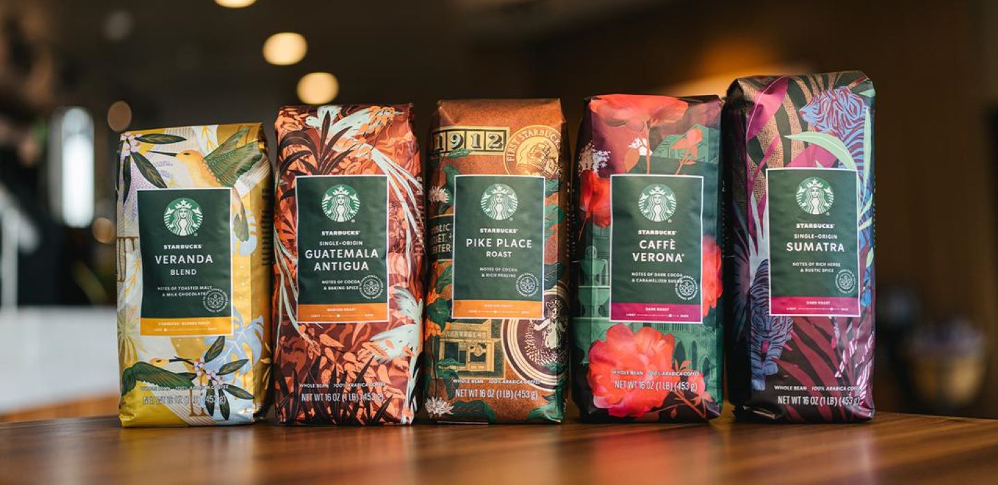
Starbucks® Pike Place® Roast

Named after Starbucks first store in Seattle’s Pike Place Market, this coffee is served fresh every day in Starbucks stores around the world. A smooth, well-rounded blend of Latin American beans with subtly rich flavors of cocoa and praline. It’s the perfect brewed coffee – a consistently delicious cup customers can really look forward to. Enjoy the spirit of Pike Place in every sip.
“In undertaking this design, we sought to leverage recognizable design elements and our brand’s history at Pike Place. To accomplish this, I utilized motifs from our heritage in a style reminiscent of travel luggage stickers and badges,” said Bridget Shilling, Starbucks designer and illustrator. “While the bag celebrates our history, I wanted to ensure the design is still grounded in coffee, so coffee plants are interspersed throughout. We use printing processes to ensure the copper hues will come to life for a warm, metallic effect.”
Pike Place is a registered trademark of The Pike Place Market PDA, used under license.
Starbucks® Caffe Verona®

Named after a city known for romance because it’s easy to fall in love at first sip. This multi-region blend has been winning hearts for decades. Originally created as a dessert coffee for a Seattle restaurant, it quickly became a hit in our stores. Well-balanced and rich with flavors of dark cocoa and caramelized sugar, it pairs perfectly with anything chocolate.
“Named after the city where Romeo and Juliet takes place, we wanted this dark roast to feel romantic and reference the ornate architecture,” said Abby McCartin, Starbucks designer and illustrator. “Layered with our iconic Verona roses, you find a bubbling fountain, ivy draping off balconies, and Italian castle-like detailing. This art is meant to transport.”
Starbucks® Single-Origin Sumatra

Grown on a lush Indonesian island, this spicy coffee is truly one of a kind. Starbucks fell in love with Sumatran coffee in 1971, and it’s been one of the most treasured offerings ever since. The taste is distinctive and unmistakable – strikingly bold and full-bodied with rich herbals, rustic spice notes and a muted acidity.
“For Sumatra, we used color to emphasize the dark roast while incorporating greens and blues along with foil on the tiger stripes and plants,” said Abby McCartin, Starbucks designer and illustrator. “I created an interesting effect by adjusting the scale of the tiger in relation to the palm trees and jungle landscape, noting the similarities between shapes of the tiger and palm leaves. Layering them adds an element of fun and mystery; you definitely see the tiger stripes at first glance, but once you look closer you find more.”
