
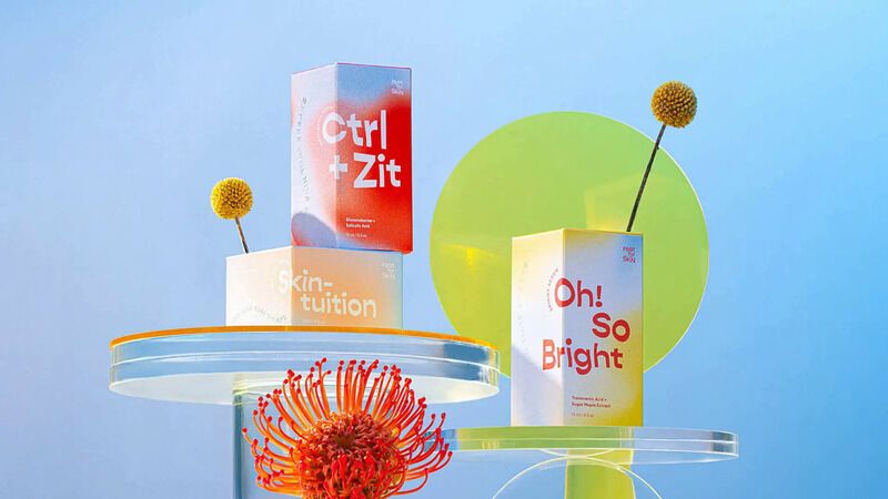
Design agency GL*TCH created this vibrant packaging for Indonesian D2C beauty brand Featforskin. Targeting Gen Z consumers, the packaging spotlights bold color gradients and is meant to embody the brand’s inclusive approach to beauty — one that is inclusive of skin tone, gender and personality. The packaging also includes gender-fluid-inspired graphics and exaggerated typography.
Challenging current beauty standards while encouraging self love, Featforskin’s packaging is bold and daring. Its design will appeal to young consumers seeking skincare products that align with their values and priorities. While product bottles and pots are accented with bright colors and typography, its paper packaging opens to reveal hidden positive messaging like “always look on the bright side.”
The brand also shares educational, fold-out pamphlets with e-commerce deliveries, diving deeper into its cruelty-free formulas, its chosen ingredients and its overall brand philosophy.
