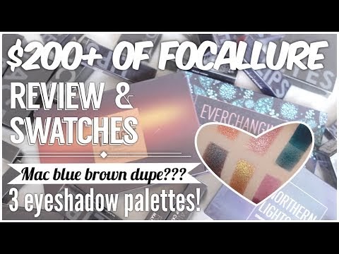
Video review here:
_________________
Twilight Palette
This pallete’s price ranges on their official site. Officially, it’s $15.99, but I got it for $7.36 on sale and as I’m typing this, it’s on sale again for $10.71. So yeah, it’s pretty cheap for a palette of 18 shades, but is it worth it though?
So here are swatches of the colours:
This eyeshadows in this palette are really, really soft. Especially the shimmers. There was just loads of fallout & crumbling. As in ABH Subculture level of crumbling. I think this could be worse, but I didn’t get the Subculture palette after all the terrible reviews so I’m not sure.
I’ve never had a pressed palette pigment be this crumbly before. I feel like I’m sharting fairy dust around whenever my brush hits the shadow. I opened the palette on my bed while trying to write down the shade names in the swatch picture, and I shimmer bombed my husband. Our entire bed is covered in eyeshadow.
I think the eyeshadows would be better placed in secure containers and labelled as loose pigments instead. When I worked with this, I have to work the way I would with loose powder eyeshadows. I love working with loose powder eyeshadow, and there’s a couple of palettes that have plenty of kickback but I love anyway (Absolute New York’s Icon palette, Makeover’s Smoky palette) but this is way worse than anything I’ve ever encountered. After just 1 swatch session, the palette looked grimy and dirty, like a ravaged drugstore tester palette after Black Friday.
The mattes aren’t as crumbly, but as you can see from the swatches, you definitely need primer for these. While they’re ok blended in softly with a fluffy blending brush when I was applying them, it’s slightly harder getting an even layer when you’re using a flat brush trying to get a pigmented, opaque layer. The darker colours were especially painful to work with and just swatching them was a frustrating ordeal that made me nearly scream, “SCREW. THIS.” while throwing the palette across the room, so many times.
There were also a lot of colours that are too similar too each other, that you can barely tell the difference once they’re on your eyes. These are the colours that are close too each other, that you they turn into the same shade with some blending, or you could easily interchange the colours without anyone noticing:
Naked & CamelNaked is white, Camel has a slight yellow tinge.
Tiramisu & Rose ValeTiramisu is Rose Vale with a slight brown tinge.
Magic & Chili (sic)Magic is a warm toned version of Chili, but both look almost identical over primer. Chili performs worse over primer though.
Need Fire & SunriseShould’ve swatched this side by side in the same row, because any difference you see in the swatches is due to lighting. In real life, I can barely tell them apart.
Party, Copper Rose & SummonThe only difference is the duochrome sheen. Summon & Party are basically Copper Rose with a blue duochrome & bigger red shimmer respectively. You can tell them apart when you pack them on hard with your fingers, but once you’re using brushes or blending them out, they’re the same shade.
I think they’re a waste and one of them should be replaced with a different colour, so it feels like I’m actually getting 18 shades instead of just 12.
Would I buy this again?
Nope. It’s a waste of space given how there’s more like 12 colours instead of 18, and the mattes are terrible.
